When we moved into our ranch home back in February I vowed to be more proactive at decorating the walls and not just the rooms. After all, art is just like the icing on a cake right?
![]()
When Art.com contacted me to see if I’d be open to reviewing one of their canvas prints on my blog, I was pretty quick in pulling the trigger. I’ve been using Art.com as one of my go-to sources for my room design clients for years. Their selection is unbeatable and so are their prices. So given the gift of being able to choose anything from their printed canvas line? AWE-some.
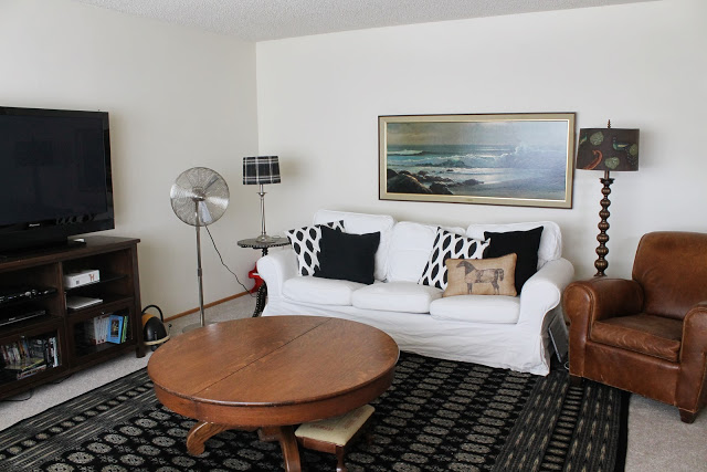
First I had to decide where I was going to put my new canvas print. Hint – That was the easy part. If you saw my previous post on the living room, you’ll remember this period piece. The ocean scene it’s depicting is nice, but it would have been a whole lot better if it was printed on canvas (or painted of course!). Also the frame and matting was pretty dingy looking. Time to go.
Now for the hard part, choosing what to get. It took me a while to narrow it down, I must admit. There is just so much to choose from! First I had to figure out what type of art I wanted.
I could choose abstract with bright, contrasty colors like this one.
 |
| Ink 12 |
Or maybe I should go more neutral.
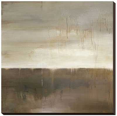 |
| September Fog Descending |
Or I could even go landscapey (yes, I might have made that word up).
 |
| St. Catherine’s Mountain, Rouen |
This seascape was nice too….but not really me.
 |
| Garage de Bateaux a Saint-Mammes, 1885 |
 |
| Silent Nature |
 |
| Untitled D0022 |
 |
| Sunrise |


This post may contain affiliate links.